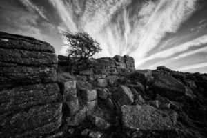
- Price range: £49.95 through £69.95 Select options This product has multiple variants. The options may be chosen on the product page
Landscape Art, Dartmoor National Park Art, Monochrome Art, Wilderness Art
Price range: £29.95 through £59.95 Select options This product has multiple variants. The options may be chosen on the product pageMinimalist Art, Monochrome Art
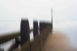
Price range: £29.95 through £59.95 Select options This product has multiple variants. The options may be chosen on the product pageIntentional Camera Movement Art, Abstract Art, Minimalist Art
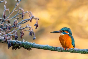
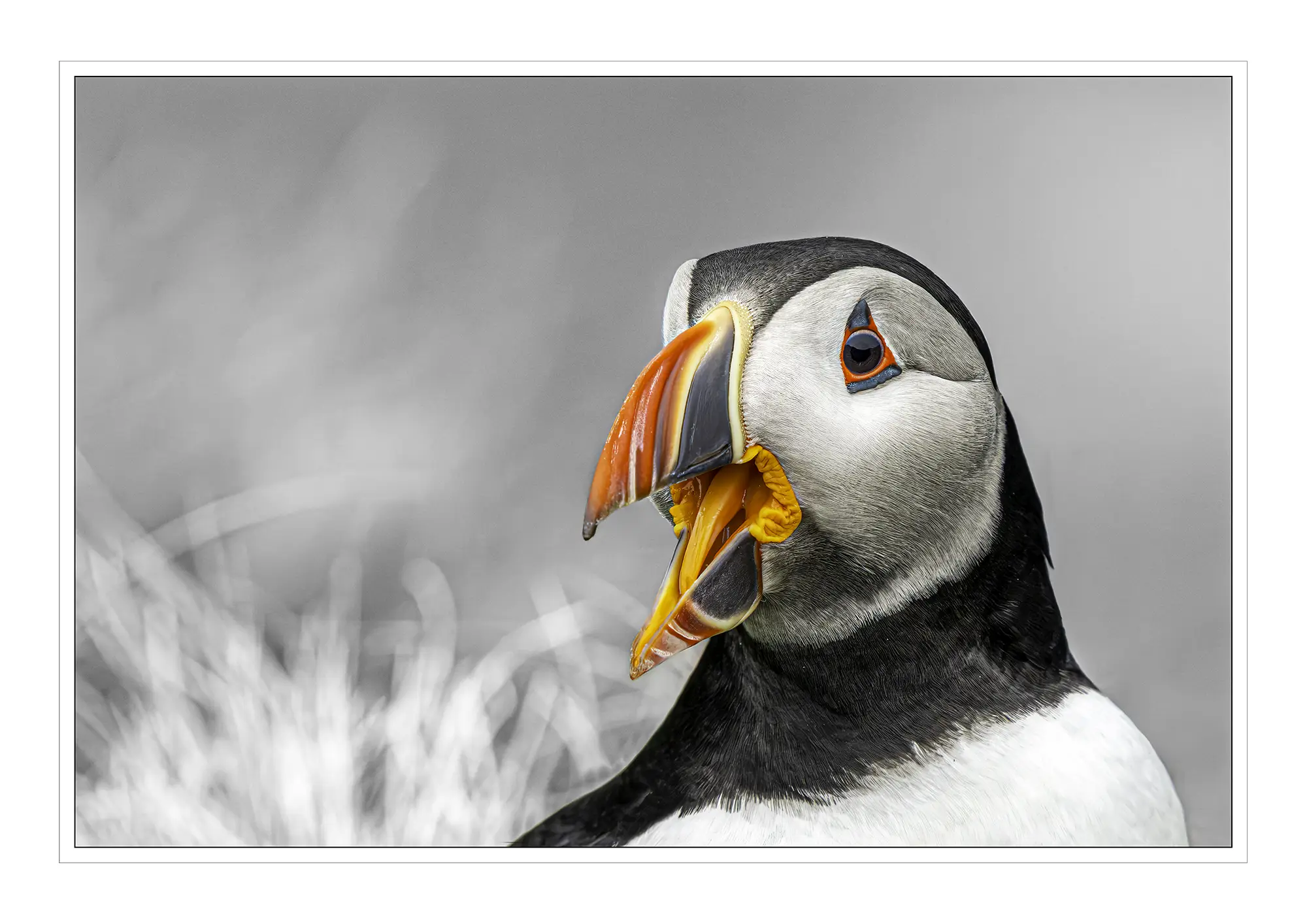
Price range: £39.99 through £79.99 Select options This product has multiple variants. The options may be chosen on the product pageTranquillity & Nature Art, Limited Edition Prints, Wildlife Art
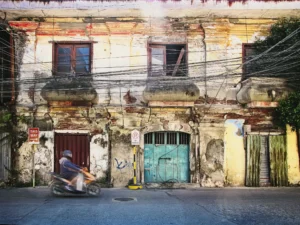
Price range: £95.00 through £125.00 Select options This product has multiple variants. The options may be chosen on the product page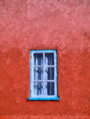
Impressionist Art, Minimalist Art
Price range: £49.99 through £69.99 Select options This product has multiple variants. The options may be chosen on the product page
Limited Edition Prints, Minimalist Art, Tranquillity & Nature Art
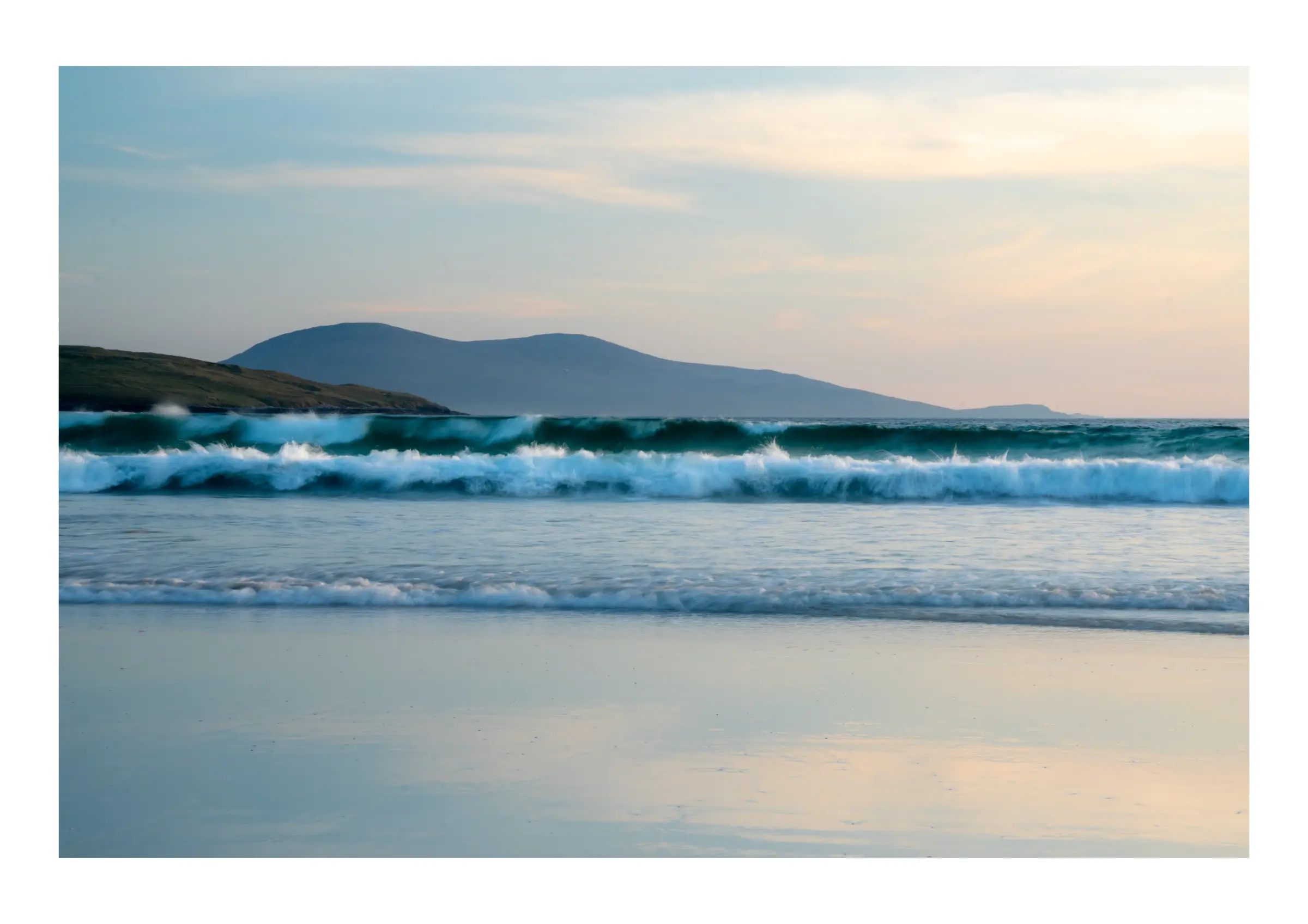
Price range: £95.00 through £125.00 Select options This product has multiple variants. The options may be chosen on the product page
Landscape Art, Limited Edition Prints, Tranquillity & Nature Art
Price range: £95.00 through £125.00 Select options This product has multiple variants. The options may be chosen on the product page